

Data Interpretation Test Practice – Day 36 | Data Interpretation Questions:
Dear Readers, Important Practice Data Interpretation Questions for IBPS Exams 2017 was given here with Solutions. Aspirants those who are preparing for the Bank Examination and other Competitive Examination can use this material.
Click Here for More Practice Data Interpretation Questions
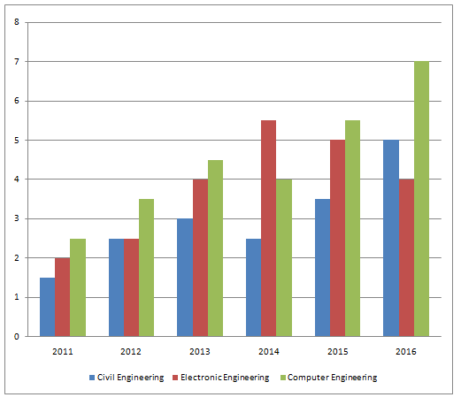
[WpProQuiz 553]Directions (Q.1-5): Study the following graphs to answer the questions given below:
Number of applicants (in lakh) for three different banking courses, viz Civil Engineering, Electronic Engineering and Computer Engineering over the years
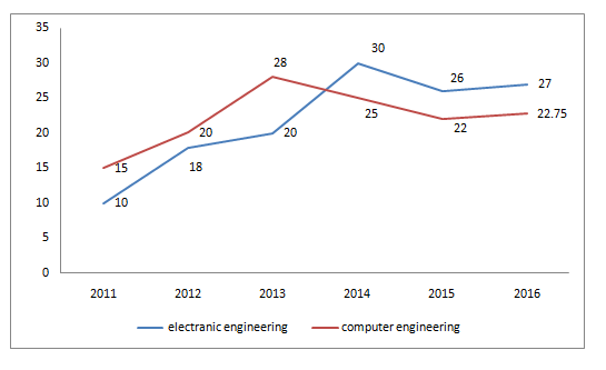
The following graph shows the number of female applicants of Electronic Engineering and Computer Engineering in thousands per one lakh.
- The number of female applicants for Computer Engineering is what percentage of the number of female applicants for Electronic Engineering in the year 2016?
- 48.14%
- 35.14%
- 60.41%
- 63.14%
- Cannot be Determined
- What is the percentage of the number of average applicants for Civil Engineering with respect to that of average applicants for Electronic Engineering over the given period 2011-2016?
- 50%
- 75%
- 66 2/3%
- 33 1/3%
- None of the above
- What is the ratio of the number of male applicants for Civil Engineering to that for Electronic Engineering in the year 2014?
- 51 : 99
- 32 : 63
- 43 : 55
- 44 : 63
- Cannot be determined
- In which of the following years the percentage increase/decrease in the number of applicants for Computer Engineering is maximum with respect to the previous year?
- 2012
- 2013
- 2014
- 2015
- None of the above
- What is the approximate percentage increase or decrease in the number of male applicants for Computer Engineering in the year 2015 with respect to the previous year?
- 8%
- 7%
- 9%
- 5.5%
- Cannot be Determined
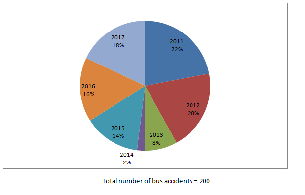
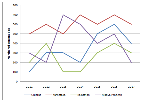
Directions (Q. 6-10): Study the pie-chart and line graph carefully to answer the given questions.
The pie-chart shows the percentage of bus accidents in different years
- What is the ratio of the number of persons who died in bus accidents in 2013 to that in 2017?
- 8 : 7
- 10 : 9
- 12 : 11
- 14 : 13
- 16 : 15
- The number of persons who died in bus accidents in 2016 is how much per cent more than the number of persons who died in the bus accident in 2014?
- 143.5%
- 137.5%
- 37.5%
- 127.5%
- 147.5%
- What is the difference between the number of bus accidents in 2017 and that in 2015?
- 5
- 6
- 7
- 8
- 9
- What is the average of the number of persons who died in bus accidents in 2011 in all states together?
- 275
- 290
- 182
- 284
- 307
- In which state is the number of persons who died in the bus accidents the maximum during the given period?
- gujarat
- karnataka
- rajasthan
- Only Gujarat and karnataka
- Madhya pradesh